01. Billion Oyster Project
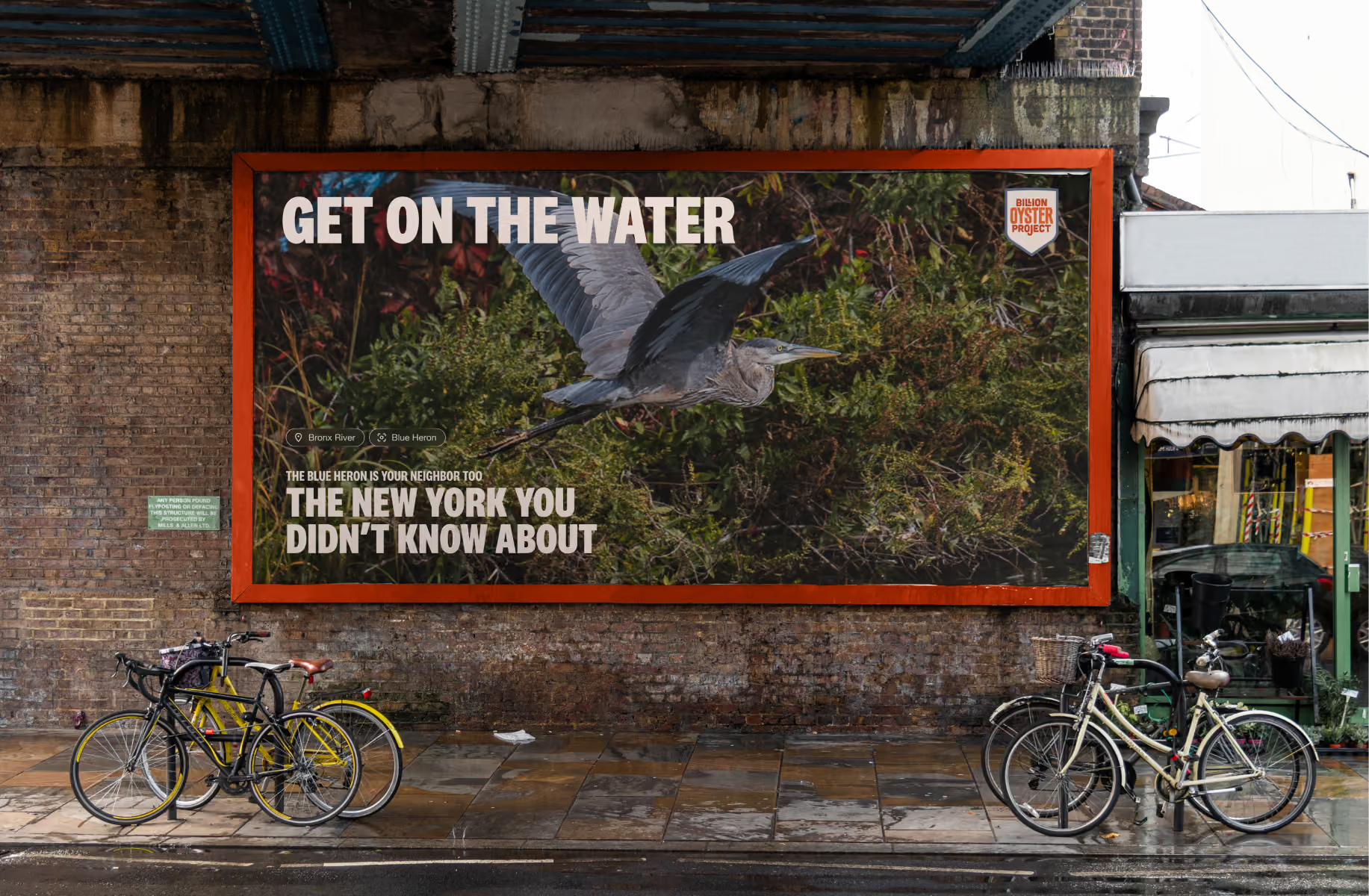
↑ Out-of-home concept, BOP branding ↑
Billion Oyster Project restores oyster reefs in New York Harbor and teaches the students who'll keep it going.
200 million oysters restored.
17,983 acres of reef.
3.1 million pounds of shell recycled.
1,793 teachers and 66,134 students engaged.
The goal on the wall: one billion oysters and one million students by 2030.
What they were after
BOP wanted to stop looking like a local org doing some good work. They already had globally recognized results. They wanted to look like it.
That meant a comms system built to go after bigger funding, tell better stories, and explain plainly what they do and how they do it. What they had couldn't. The identity was dated. The website ran to 40-plus pages on a basic Squarespace template, with a journey that lost people halfway through. Nothing held together.
What was in the way
Website, decks, social and newsletters had all drifted apart. They shared a few colors and typefaces, sure. That was about it.
Decks were the worst of it. Built in Google Suite, so the brand fonts couldn't be used at all and everything fell back to odd substitutes. Photography was whatever could be found.
It went further than design. Nobody had a system for who held the passwords to their own channels. We spent the first couple of weeks getting those into one place.
A rebrand was already underway when I came in. Nobody had made anything bad. It just wasn't the transformation BOP was after. Basic typography, basic layouts, graphic elements stacked up to show that some work had been done. It would have been born-dead. Forgotten the minute you scrolled past. No flavor. No feeling.
The team could feel that. They couldn't say why.
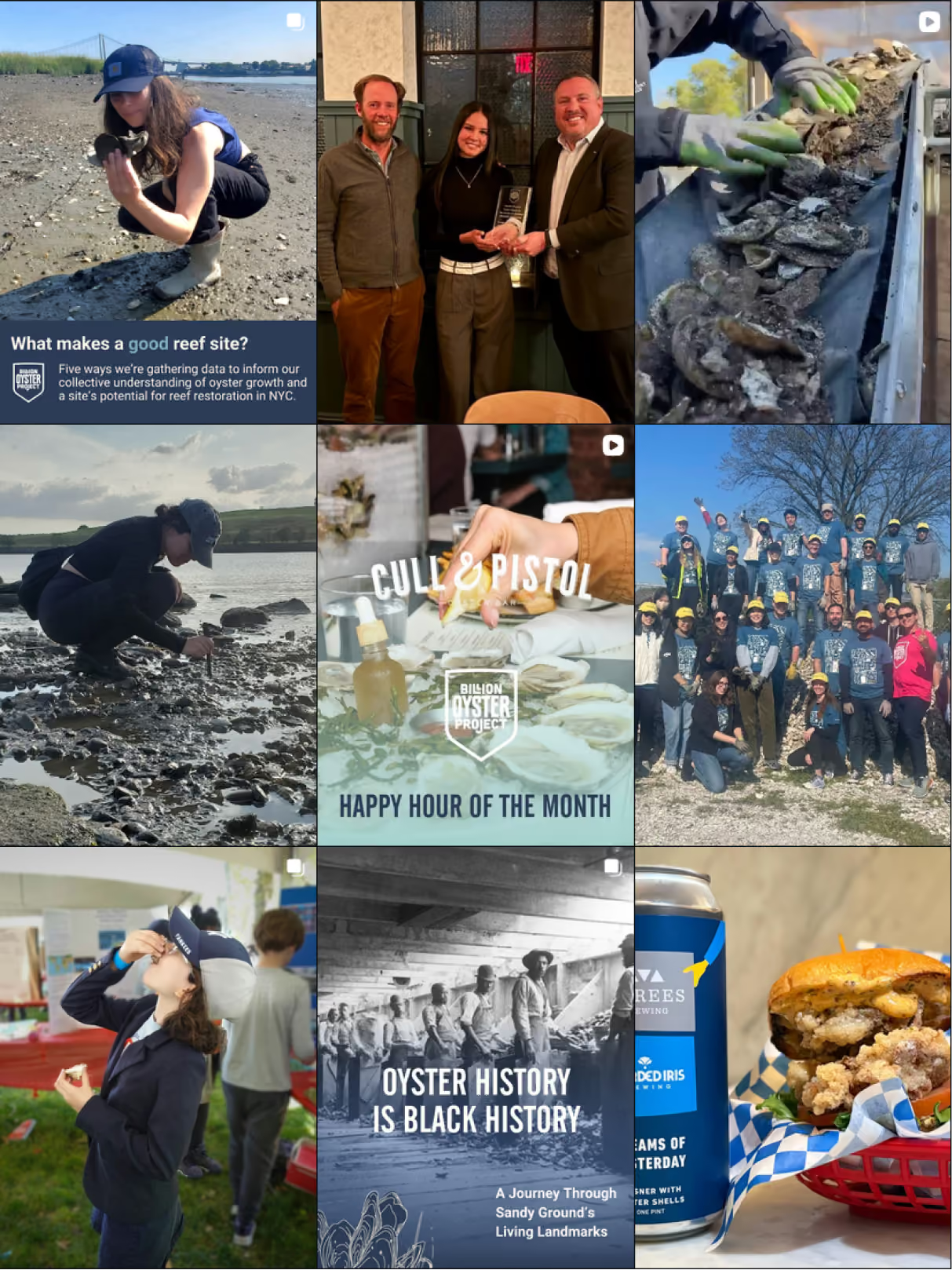
Before
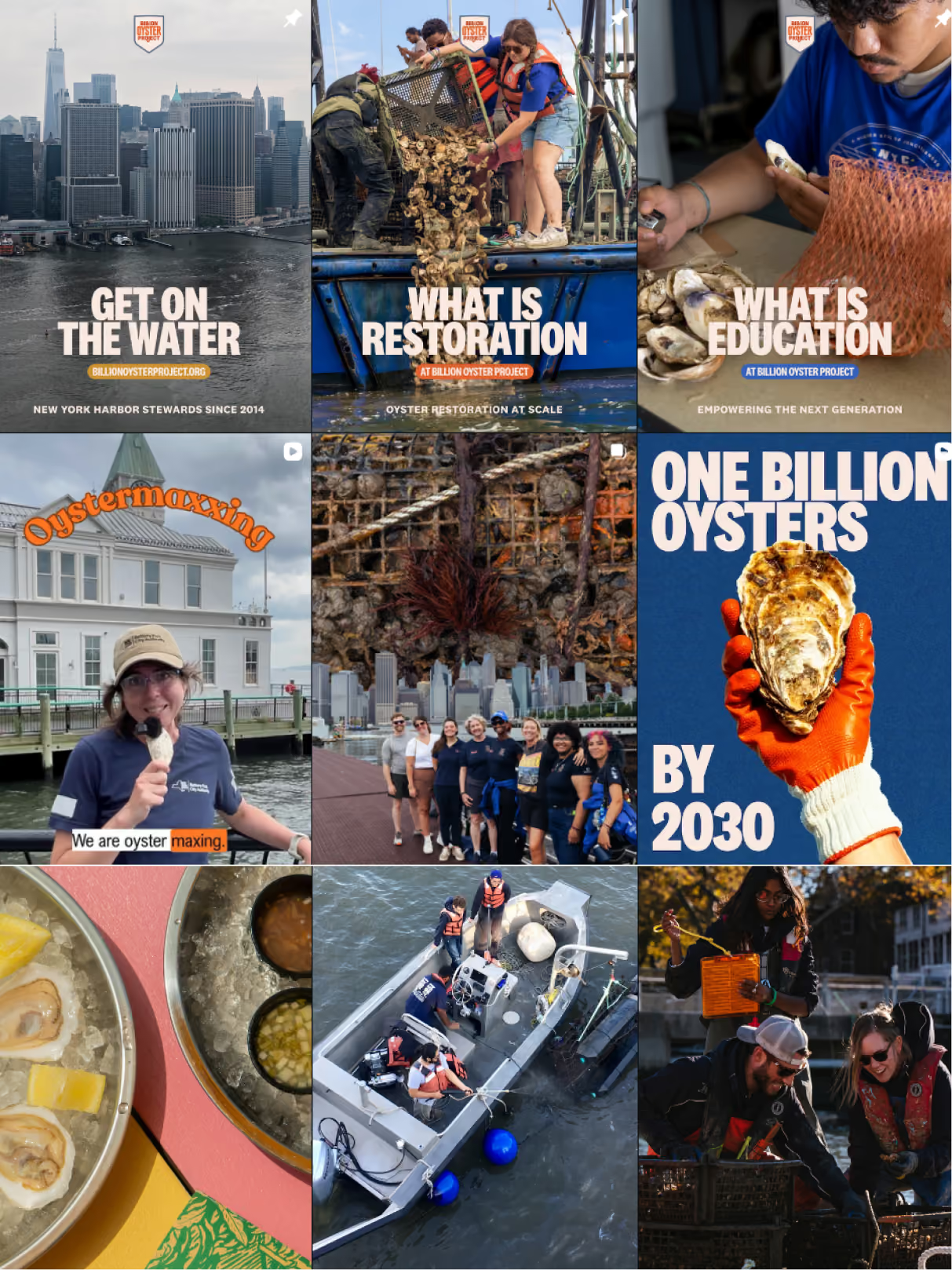
After
↑ State of social media before/after ↑
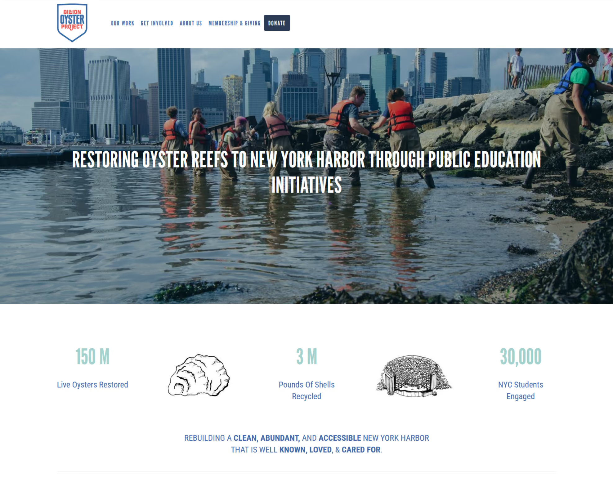
Before
↑ State of website before ↑
The problem was conviction.
The call
Inside the building, BOP knew exactly who they were. An institution that restores biodiversity in New York Harbor, and educates the next generation to make it last. Everything on the outside still presented an organization in search of itself, asking for permission it had already earned.
So the direction had to say what the team already believed, and what the numbers already proved. I put a few stylescapes together and one of them landed. It told the story of an org that tried, learned, matured, and scaled.


↑ winning art direction ↑
What I did
Art directed the rebrand end to end. Identity system, illustration system, and the visual language across every channel.
The website was rebuilt from scratch around the story, with a real journey for each audience. Design and Webflow build handled by a collaborator working off my direction.
Then the parts that keep it alive. Decks and templates so the brand survives daily use. A full social suite with an editorial calendar running to year end. A newsletter system, deliberately simple. BOP doesn't need a complex design system at this stage. They need one they can actually run, that grows as they do.
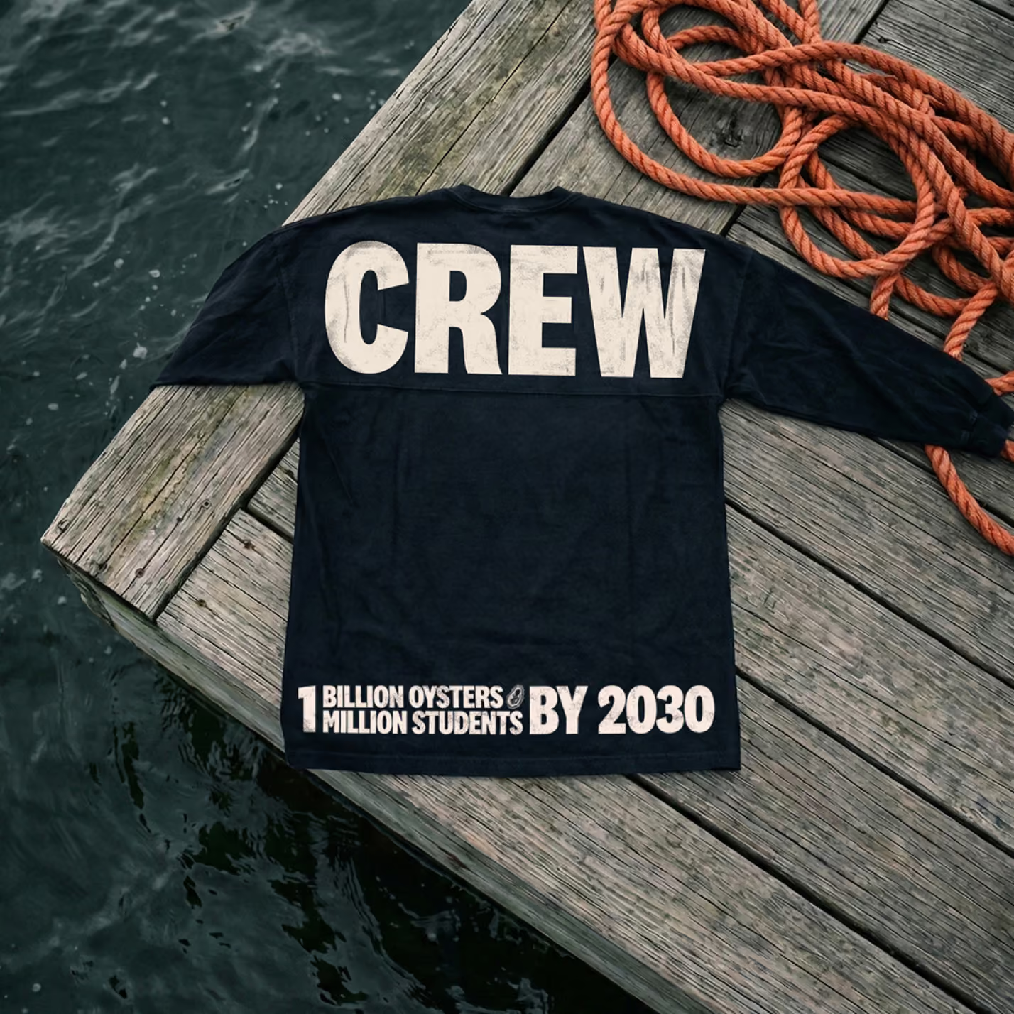
↑ Gear & merch designed for the team & for sale ↑
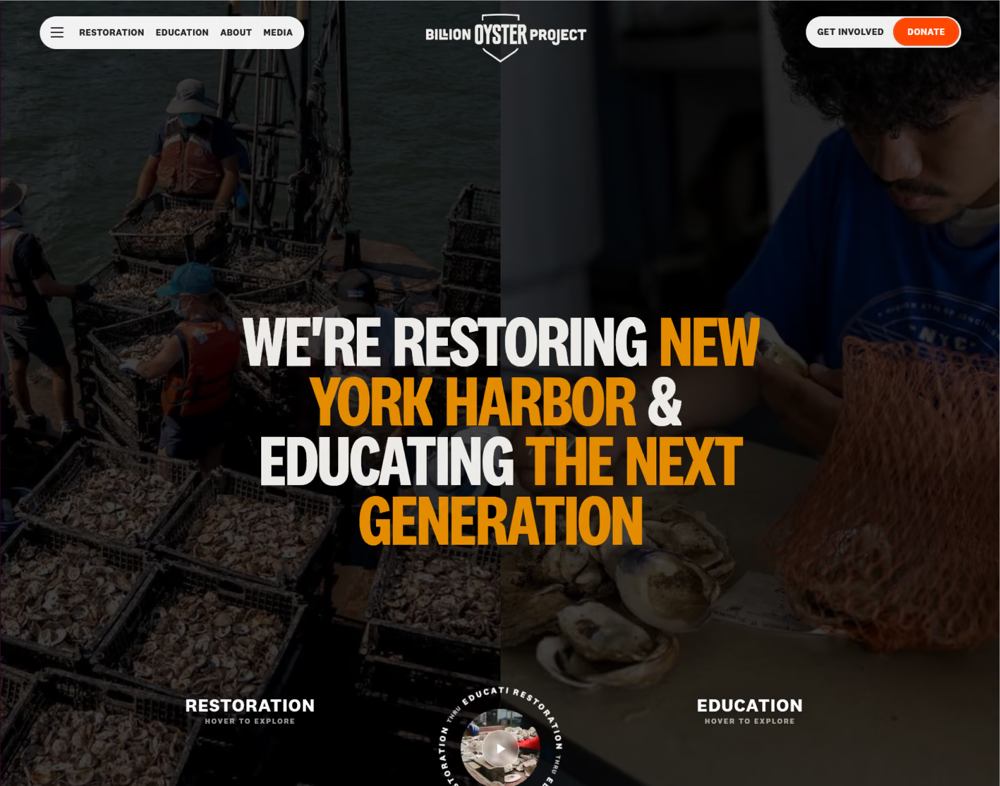
After
↑ State of website after - visit the experience ↑
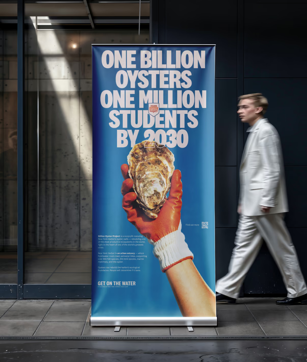
↑ Roll up banner ↑
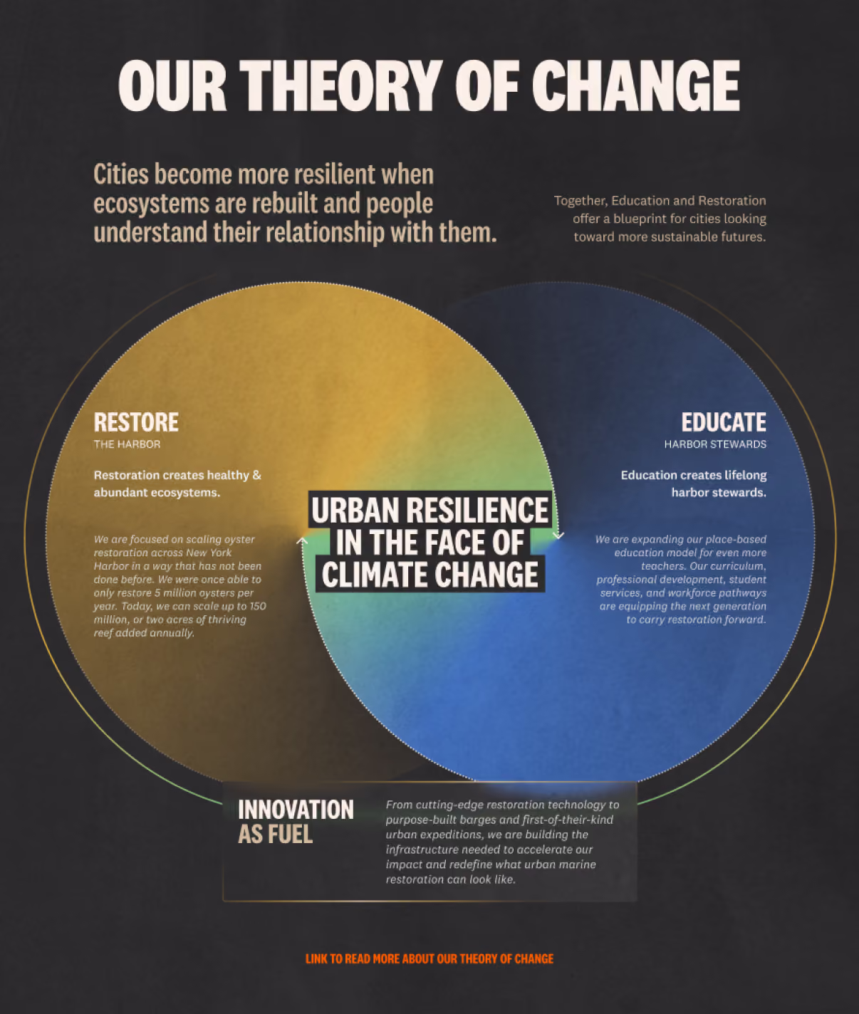
↑ The theory of change ↑
It sold out in five hours.
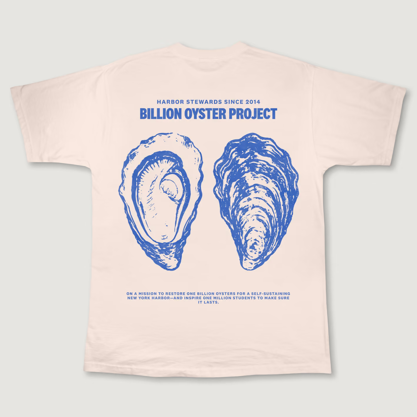
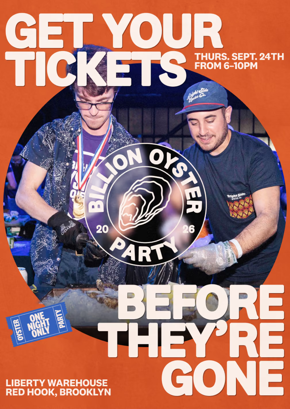
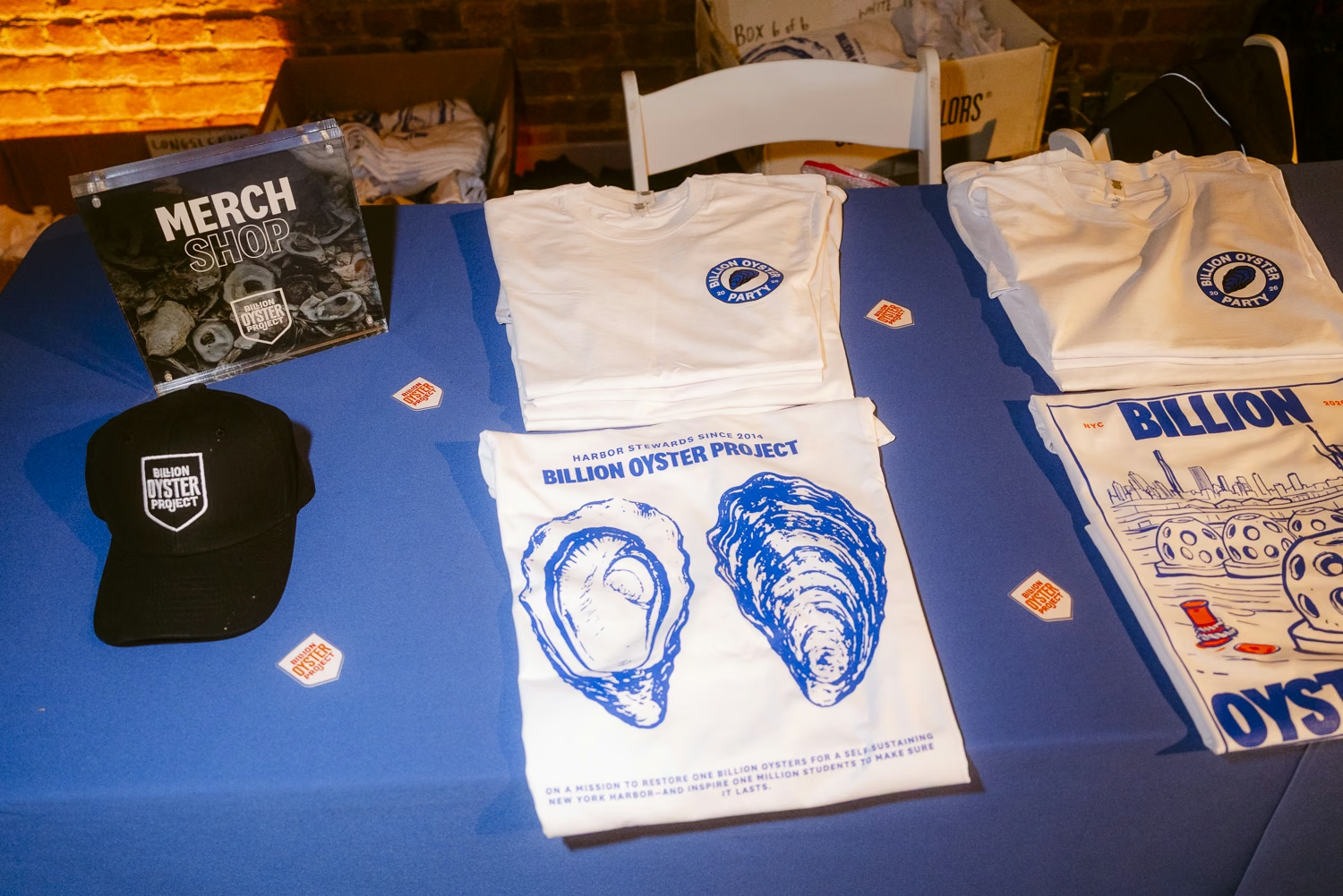
↑ Merch & communication for the oyster party ↑
What changed
The brand rolled out in early August 2026. Most of what matters won't be measurable for a while.
One thing already is. We built the comms for the annual party. It sold out in five hours. The reminder posts and last-call newsletters we'd scheduled never had to run.
Reactions have been positive across the team, the board and the audience. Social is running around +1,200 followers a month since rollout, currently about 44.2K. The rest of the work is still being built.
How I work
Most teams can feel when something is wrong before they can explain it. My job is to name it, then be accountable for the direction that follows.
And to build only what an org can actually run. Make something nobody can maintain and it gets dropped.
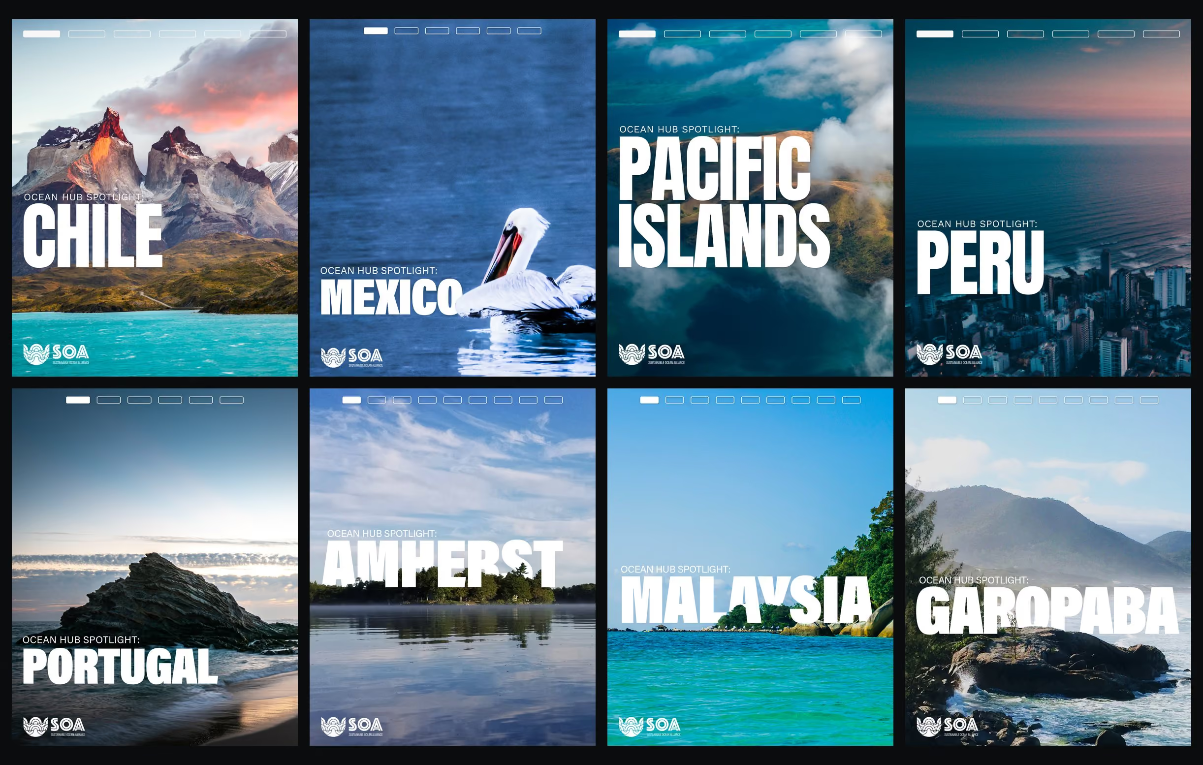
Tell me what isn't landing
If something specific is coming up — a report, a campaign, a rebrand you're not sure about — say what it is. I'll tell you straight whether a read is the right thing, or whether it isn't.
Or email hello@graphikas.design