04. Mangrove Breakthrough
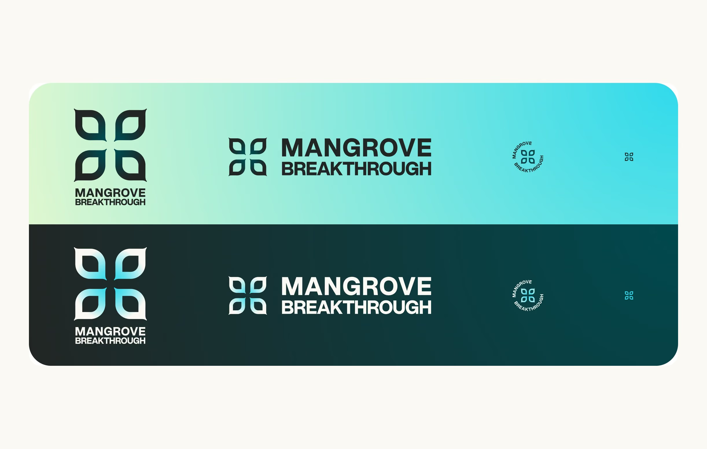
↑ The clover and its lockups, from the brand guidelines ↑
The Mangrove Breakthrough is the global push to protect and restore 15 million hectares of mangroves by 2030.
Established at COP27, co-designed with the Global Mangrove Alliance.
$4B in capital to mobilize.
50 governments have endorsed it so far.
What they were after
A new brand and website, ready by the end of May 2025.
It had to be something governments, investors, NGOs and coastal communities could all put their name next to.
What was in the way
Nine weeks, from the first sketch to the deadline.
A coalition, with many decision makers. Feedback came from a lot of directions and was hard to pull into one answer.
And a crowded shelf. Most mangrove organizations put roots in their logo.
The mark had to look like nobody else's in the room.
Explored
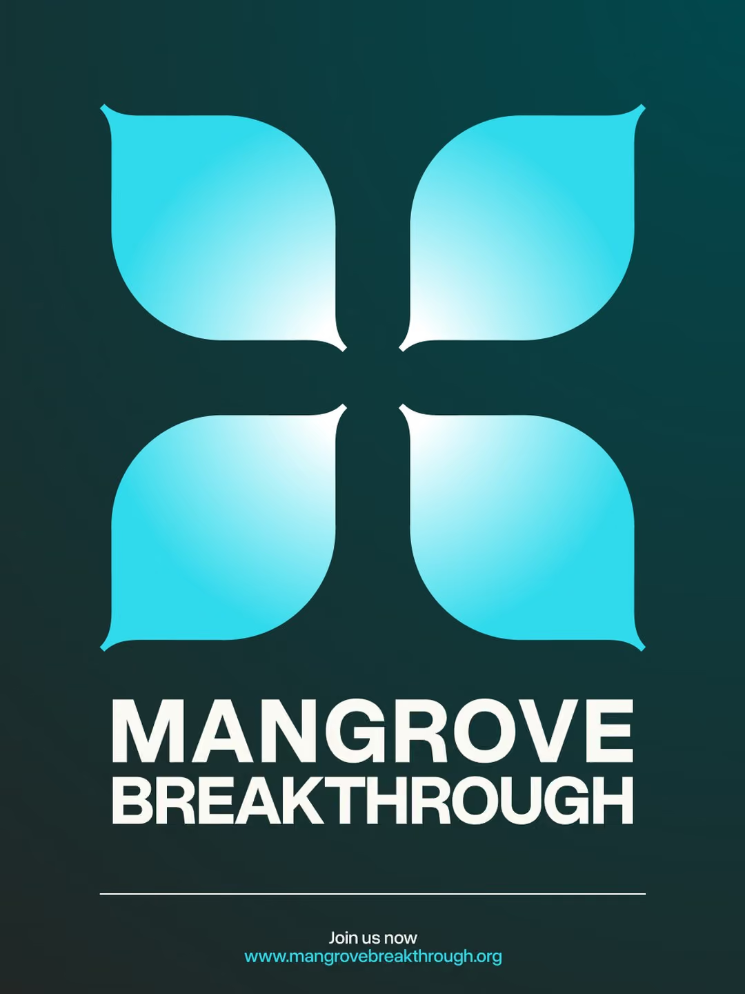
Chosen
↑ The typographic route we set aside, and the clover that went forward ↑
Everyone draws the roots. I drew the flower.
The call
The mark first. Mangroves flower, and hardly anyone shows it. So the logo is four petals: simple enough to work as a favicon, open enough to hold a photograph.
Then how to present it. I explored several routes: a typographic rallying cry, circular badges, stacked wordmarks, the clover. With the project lead, we chose one to take to the wider group, and checked it side by side with the partner logos it would sit next to. With that many voices, a menu of options turns into a vote. One route, with the reasons written down, gets a decision.


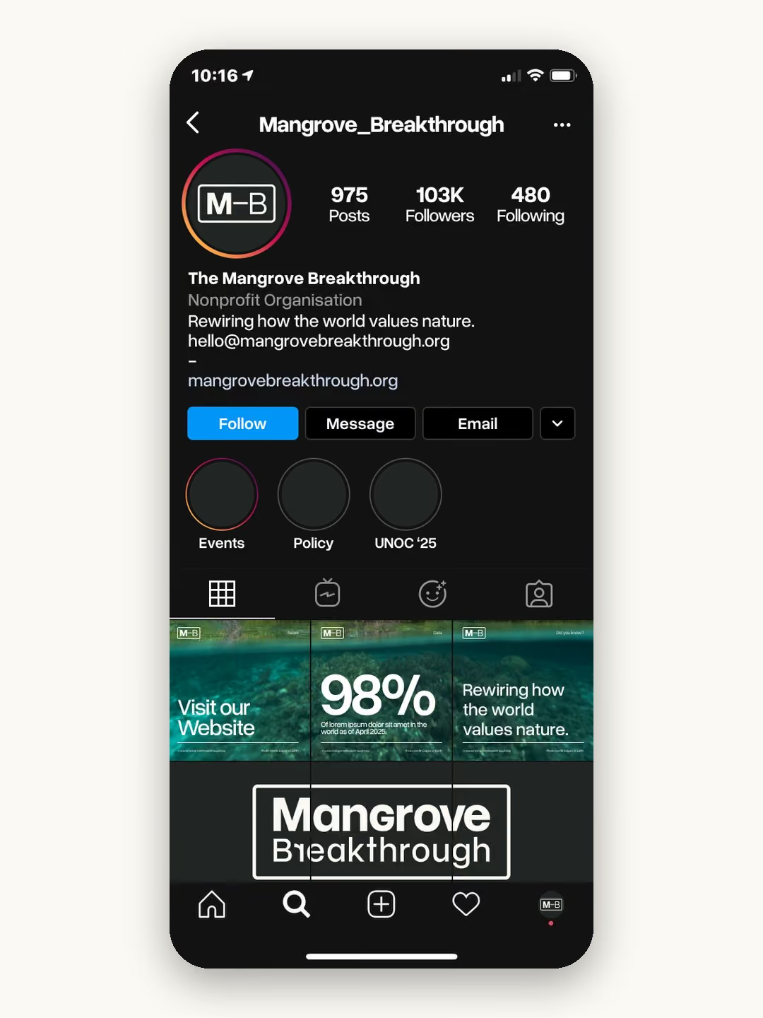
↑ Social templates (top) and pages from the brand guidelines (bottom) ↑
What I did
I designed the identity: the clover and its lockups (stacked, standard, a round badge for profiles, a favicon), a palette taken from mangroves in the wild, and Overused Grotesk for type.
The brand guidelines set out how to use all of it, and ten social templates show it at work.
Then I built the website in Webflow, from a template restyled to the new brand, and drew an illustration for it. An early version went live on the deadline. The full site followed a month later.
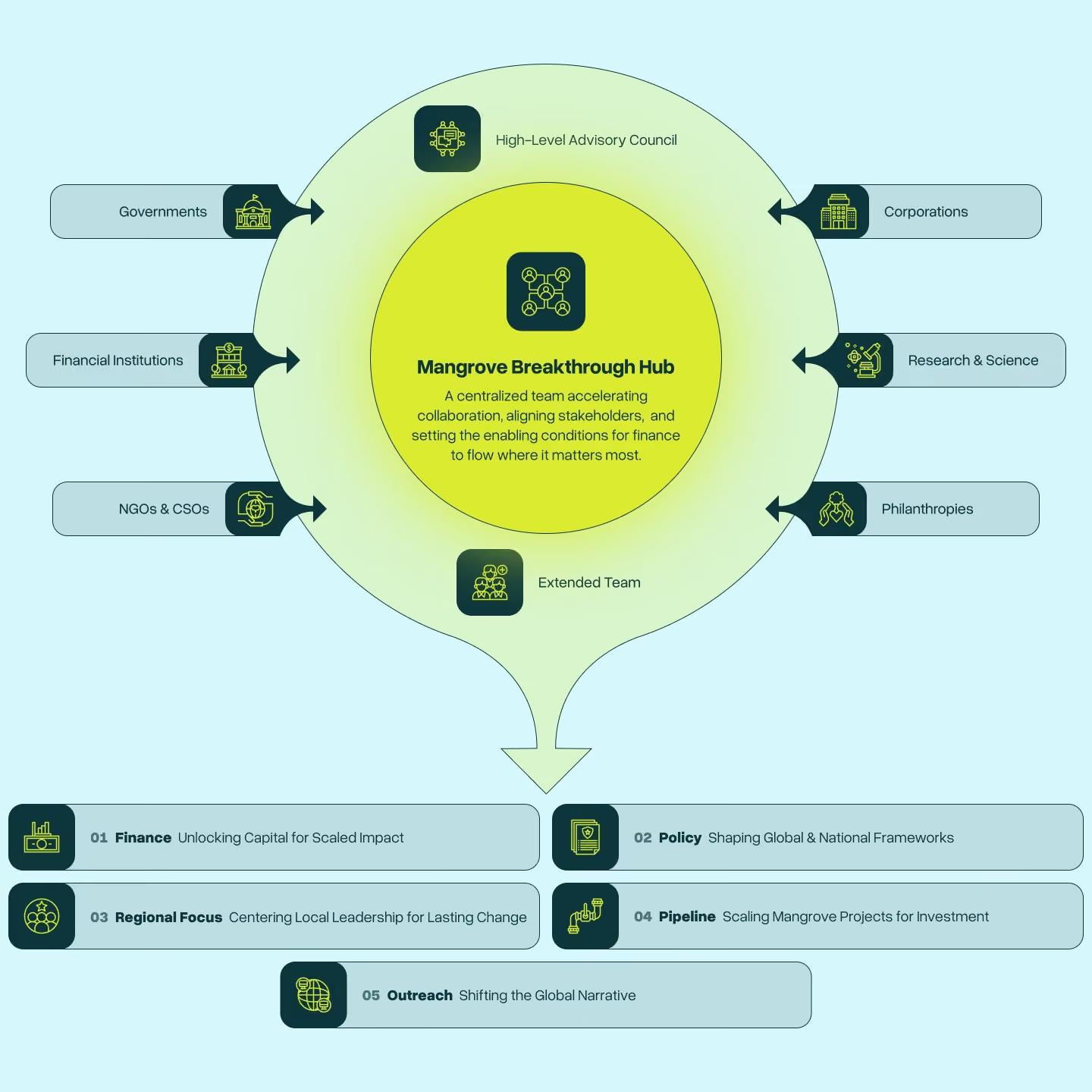
↑ The stakeholder map, drawn for the second pass ↑
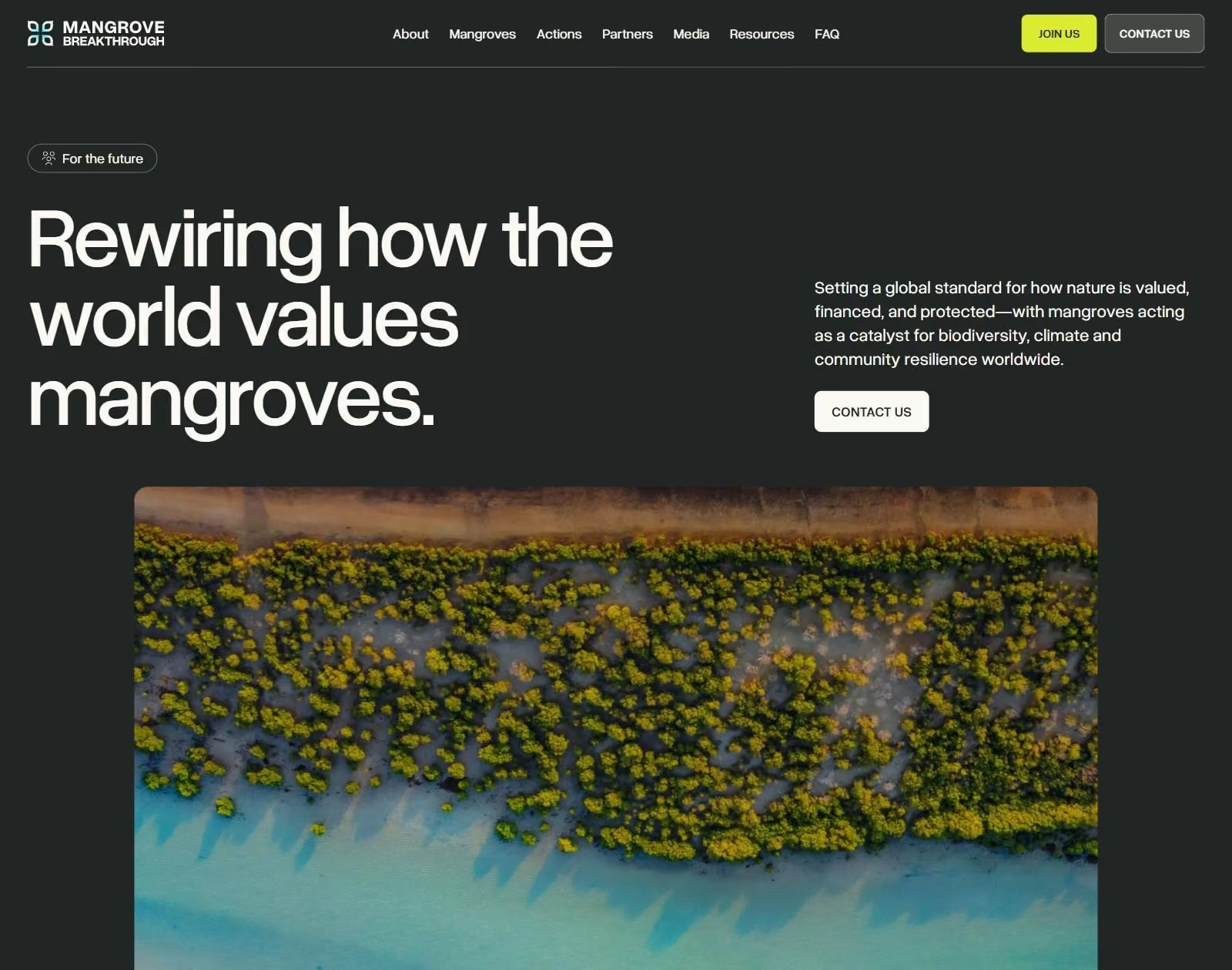
↑ The homepage, live at mangrovebreakthrough.com ↑
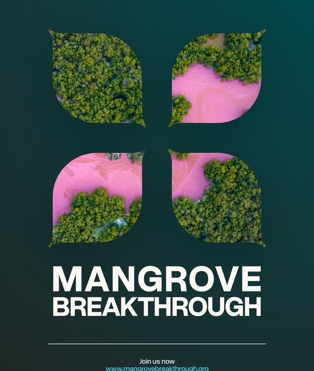
↑ The petals, cut out of the photography ↑
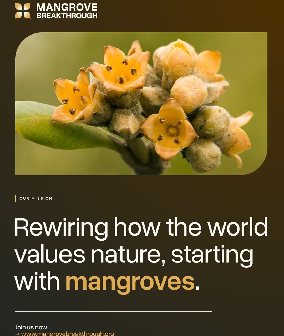
↑ A social template, built on a mangrove in flower ↑
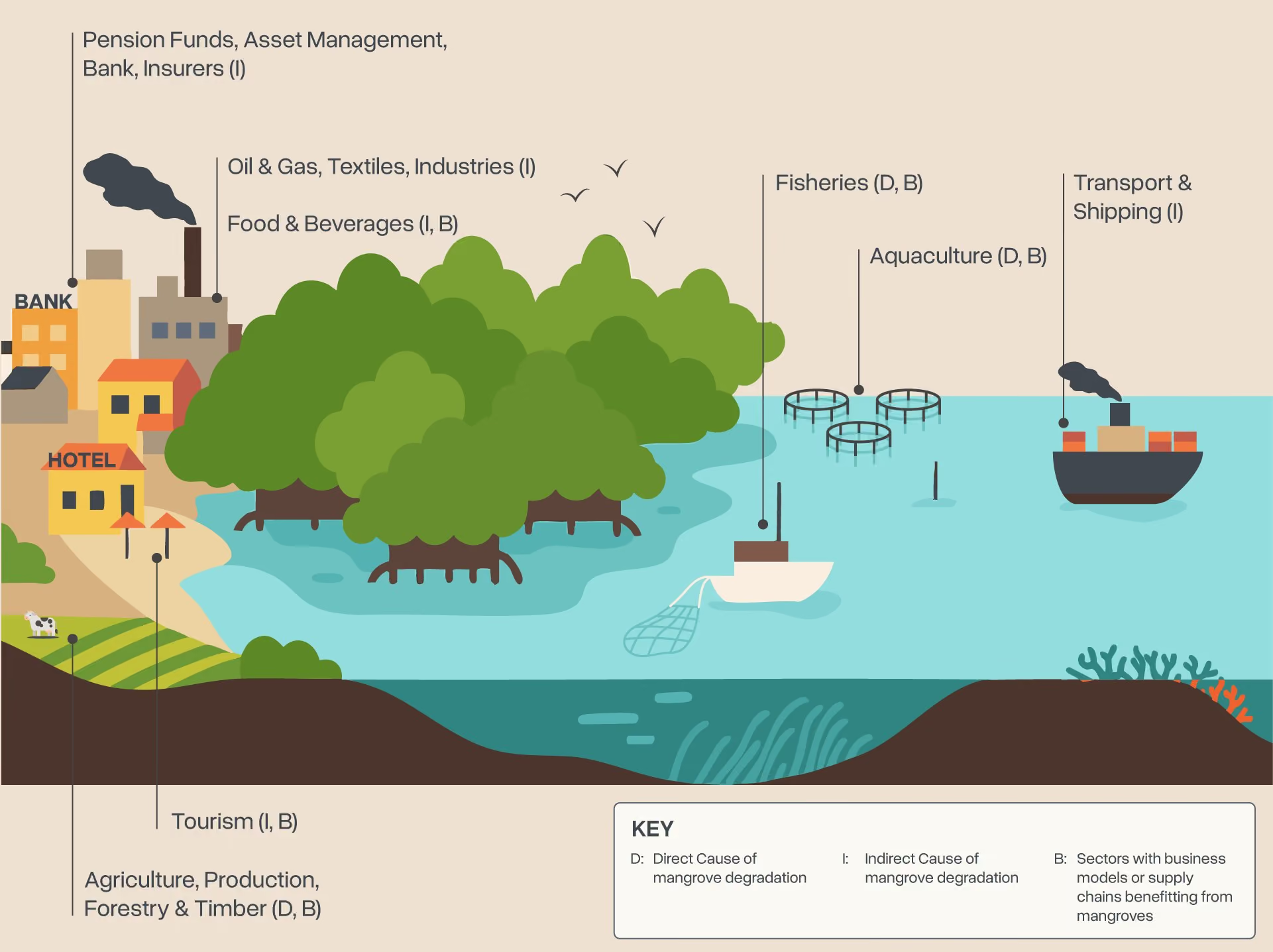
↑ The site illustration: who depends on mangroves, and who wears them down ↑
Then the site grew up.
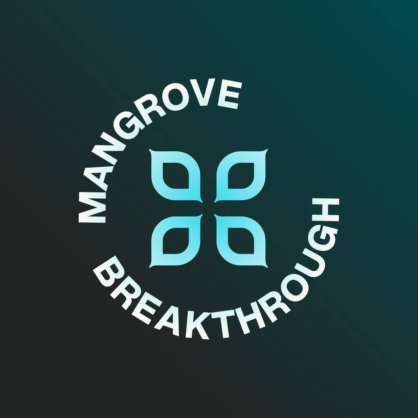
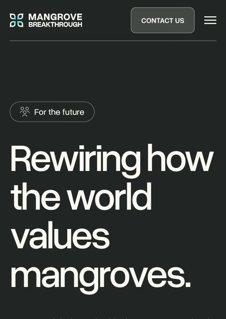
↑ The profile badge, and the site on a phone ↑
The second pass
Six months after the launch, the Breakthrough came back for more.
The site gained a newsroom, a partner directory, a resource library, team and advisory pages, and a stakeholder map.
At handover, the team got a short video for each task, so they could publish on their own.
What changed
The Breakthrough has one face now, from the Instagram profile to the press releases.
The early site met the deadline, and the full one followed a month later. The second pass gave the team a site they run themselves: stories, partners and resources, published in-house.
How I work
When a lot of people have a say, I bring one route to the table, with the reasons written down.
And I hand over a site the team can run: content in the CMS, and a short video for each task.
Tell me what isn't landing
If something specific is coming up — a report, a campaign, a rebrand you're not sure about — say what it is. I'll tell you straight whether a read is the right thing, or whether it isn't.
Or email hello@graphikas.design