Fraktine, Design of a blackletter typeface
Fraktur: (German: [fʁakˈtuːɐ̯]) is a calligraphic hand of the Latin alphabet and any of several blackletter typefaces derived from this hand. The blackletter lines are broken up; that is, their forms contain many angles.
The word derives from Latin fractūra ("a break"), built from fractus, passive participle of frangere ("to break"), the same root as the English word "fracture".
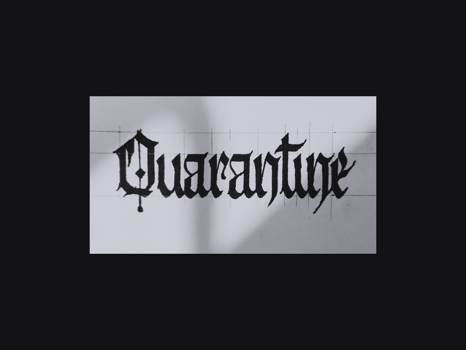
During Quarantine, I set on to create a typeface, inspired by Fraktur-typography. It started out a simple word submitted by a friend on Instagram (Quarantine):


Here was the first look of the entire typeface


Already I spotted some serious issues, which I corrected on day 2:

Then were the Uppercase


As I progressed, it fueled my content creation. I was sharing daily the progress on all my socials and gathered helpeful feedbacks, leading to more and better updates...


Then I brought in ligatures
The connection between two letters, like "fl", "fi", "ft", etc. I won't get into details, but we use them to correct problematic zones of a typeface, and bring in more visual harmony.


Created posters to stress test the typeface


Added more characters, refined spacing (space around a character) and kerning (space between two set of letters, i.e: Aa, Ab, ab, etc.)...
Finally, I could share it.


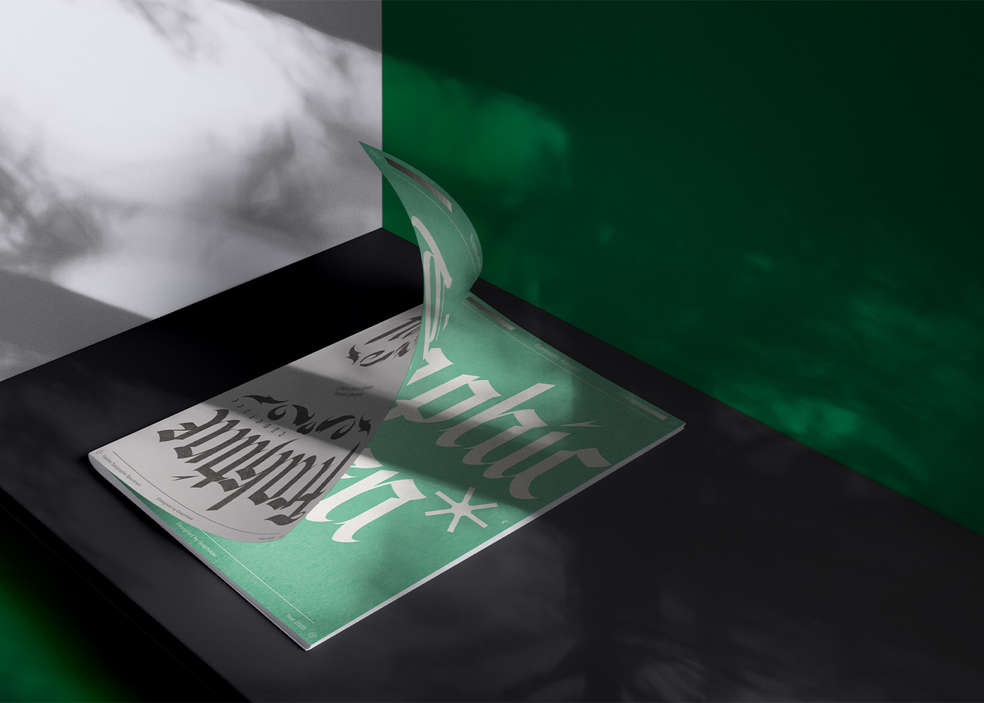
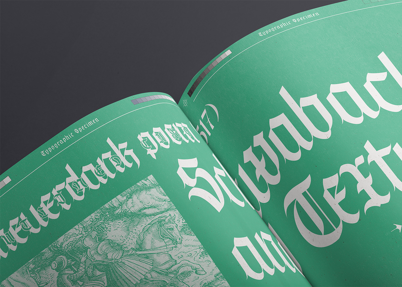
But my tasks was not complete. So I created the typographic specimen, a document used to showcase the design and the usage of the font.


Thanks for watching
No items found.

